

Primary reference photo

Adjusted reference photo (PhotoDirector)

This is A1 black card prepped with black acrylic gesso. This will give me the dead-black background I need for the lit foliage, and the white areas are the base for colour underlays I want to pop from beneath the darker foliage. That’s the plan anyway!

These are pouring paints; transparent and luminous so very good at being ‘lit’.
3rd August.

This says to me that, while stark black works well in a photo, it’s less successful in a painting, or at least in this painting. There is, in fact, a couple of large shrubs that fill that space so I think I’ll bring them in.


First pebbles. This could be tricky as they don’t fit the brief, as it were, in terms of brush strokes.
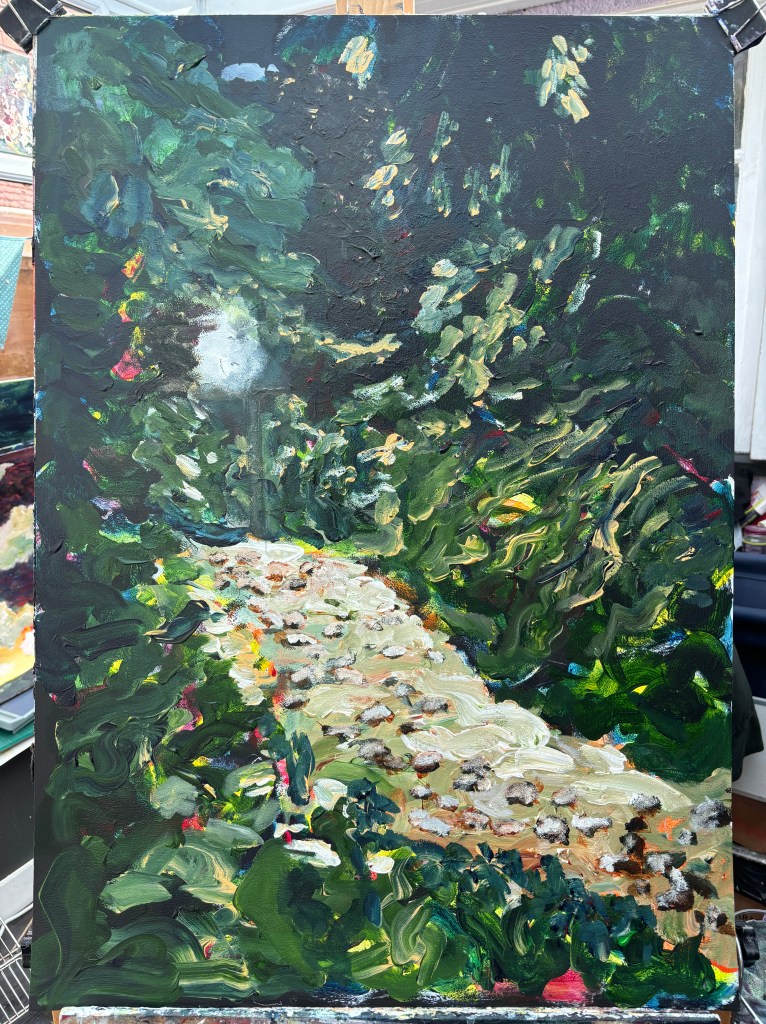
Spotlit pebbles, not quite indicative of shingle but closer.

There’s nothing quite like a Payne’s Grey wash to put very bright colours in their place. The shingle looks rocky with highlights and the plants have shine where they should have shine. I’m not sure yet about the pergola post. It’s too structured, too architectural, and the spotlight isn’t fixed to that part anyway. I may just have talked myself into obliterating it.
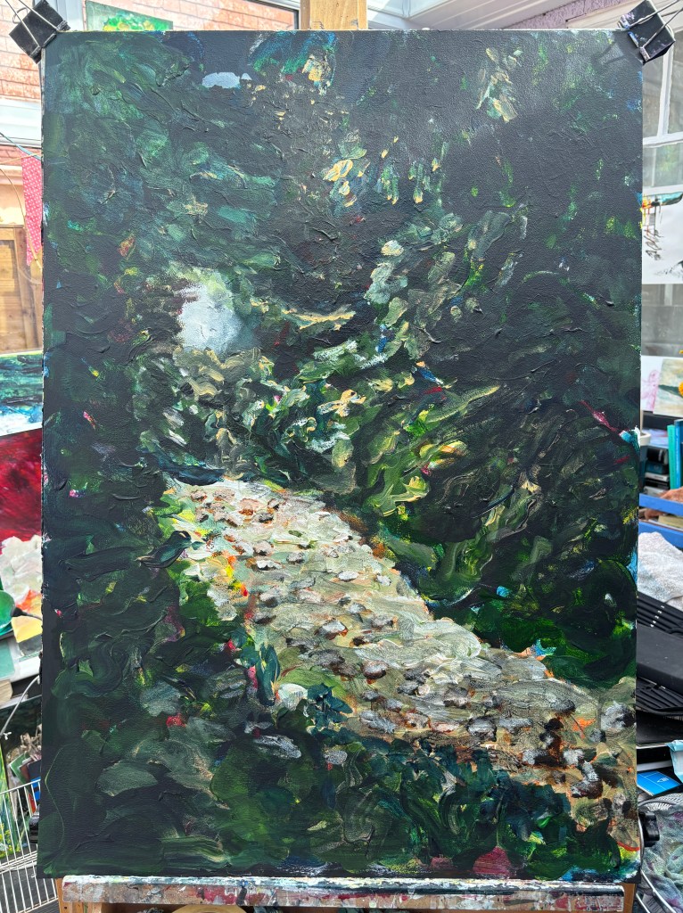
I think the post-mask foliage needs to be darker and behind the spotlight.

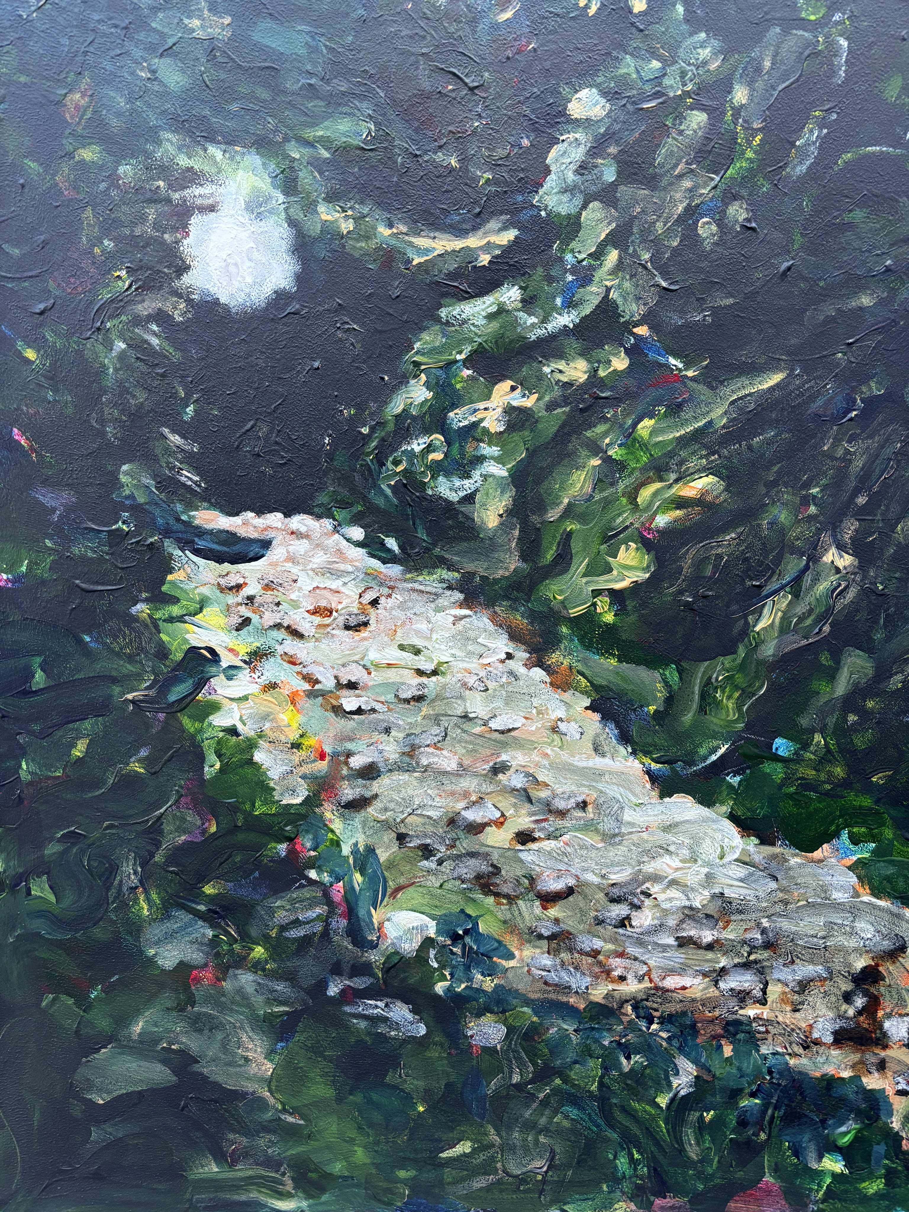
That feels better. I’ll see if I can get a better photo when the light has settled.
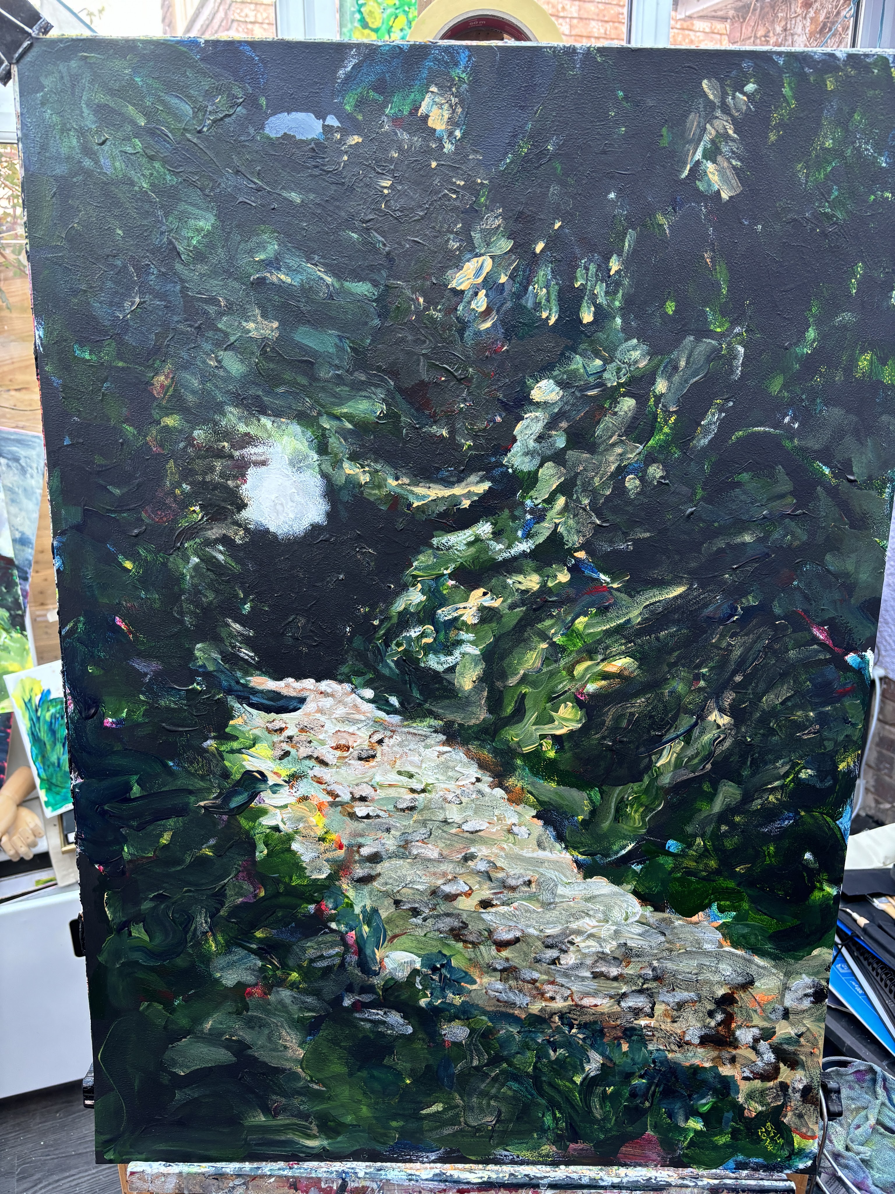

Artificial light at night. This one has lost all the blues. Which of these is my painting, I wonder?

SCH 2024
