


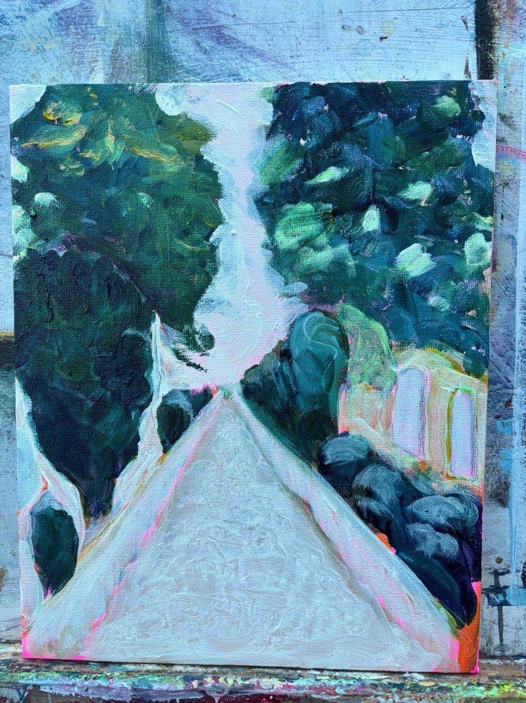
When you start to like the first thing you did (Church path)
It’s happened again.
That rough paint sketch
Bright orange where no orange should be on a vicar’s path
And pink
Shocking luminous pink (Ooh Missis)
In the brickwork
Of its walls.

It’s rough
It’s unschooled
It’s brash
It’s not finessed
Or finished

Then when it is
I like it best when it wasn’t.

Conboy-Hill, 2024
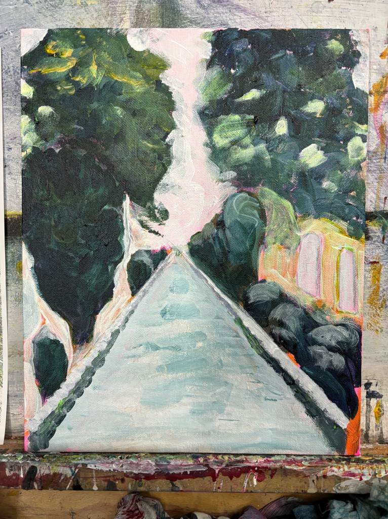


Whenever I hear myself think, that’s it, I know it isn’t. The photo is in full sunlight so it’s a bit odd but it also feels as though it’s lacking a highlight of some sort.


Exercising the ‘leave well alone’ principle with this physical piece.
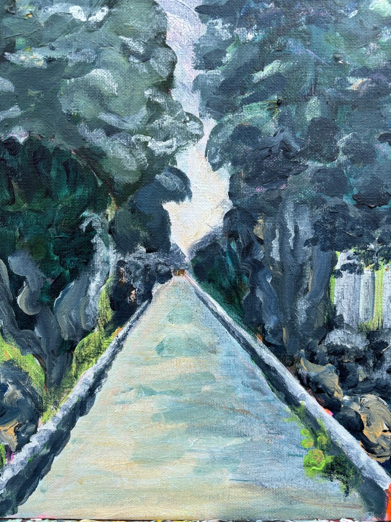
7th April. I am investigating easy ways to sell prints and the like and remembered Redbubble where I have a dormant account. I cleared that out and uploaded heavy-duty files of a few landscapes, including this one. Then, although they’re already unleashed on the public (no private option while you set things up), I ordered some samples to see how they translated.
The first to arrive is a photographic print of this painting and, as I think might be evident from the photo, the colours are slightly different. It also looks a little ‘thinner’ which might be due to the enlargement.

This bothers me although it’s unlikely anyone who bought it would notice because they wouldn’t have access to the original for comparison. My feeling is that some digital adjustment to the upload file might help – pulling up the contrast and saturation a little perhaps. Another feeling is that block colours probably work best, having a fairly simple appearance with clear edges and contrasts.
First though, some comparisons from a different company. Vistaprint is an established company I’ve used many times for prints and posters, cards and calendars. Their output has always been good although I’ve never given them anything like this before. Downsides are that they cost rather more and I would have to send on anything I ordered for a customer which would involve more postage.
The other items I have on order are an art board, a cushion cover, and a pin button using different pieces of work. There’s mileage, it seems to me, in having a variety of surfaces to offer alongside the usual cards should I find myself in a gallery.
I’m filing this under ‘getting your work out to the public’.
SCH 2024
