The theme is crystalising into a commentary on the invasion of the natural world by the built environment. The concrete monstrosity which is the flyover exemplifies the dilemma we have – connection and commerce or nature and stagnation. Of course, those aren’t the options, just the polemic. The options are to build better, to accommodate rather than subjugate the natural world, live with it not just on it, come alongside instead of flattening everything with our ambitions.
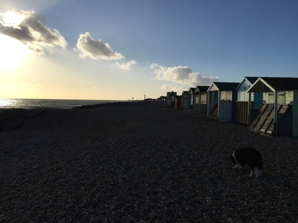


This is the combination for now, but I’m not happy with the overlay so that is likely to change. In the meantime, another large canvas has had its memory wiped to accommodate the new painting. So here’s Lancing beach having a hard time in the dystopian future.


Here we go. There’s ready-made texture from the previous painting that will add idiosyncratic movement and shaping to this. The first stage is a layer of white primer, another of dilute cad yellow and burnt sienna, and a rough drawing of the scene. I’ve placed the beach/sea area slightly lower in the frame than in the photo so that I can make more of the sky. I’ve also raised the sea level slightly but that may be temporary, we’ll see how it works out.

I really like how the collaged textures beneath the new layers are making stories here, although I’m not sure how to provide a rationale for the cocktail sticks that once had union flags on them! Quite a lot in the bottom section needs darkening now, gradually, and with some subtlety to accommodate the idea of a pebbled beach and minimise the strength of the breakwater rocks that run diagonally from left to right. The beach huts need some attention too – less outline, more suggestion. At the moment there’s a hint of seawater in the foreground and I quite like that even though it never happens at this location.


Think I should lose the beach huts.
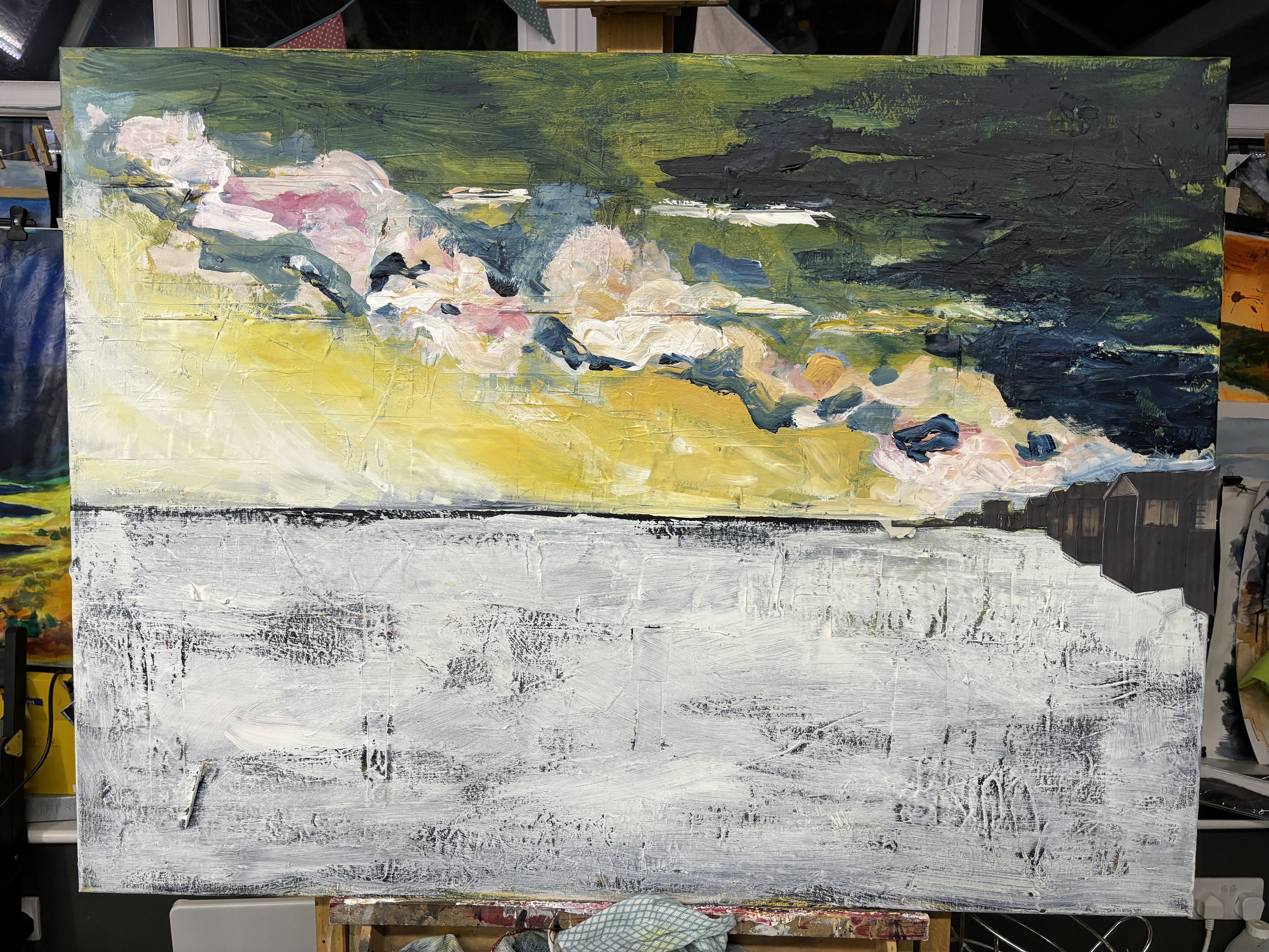
I’d love to claim I painted those huts, but actually I enlarged a crop of the original photo and cut out a template to guide me when I do. This gives me the outline top and bottom and the perspective angles that I find quite tricky. The colours are spot on as well.
13th March. I’ve done a lot of re-jigging with this piece and finally got it the way I want it. The photo doesn’t quite get the darks right [because iPhone camera] but otherwise I’m happy. I bumped up the contrast and saturation a bit in PhotoDirector for the AR/video as these need a little more visual oomph to support the layers.

A shipwreck, two whales, and a factory
No connection, obviously.
Nothing to do with polluting emissions leaching
The oxygen out of the atmosphere, leaving
Nothing for breathing.
Conboy-Hill, 2024
There’s a couple of points to make here. The first is that colour depth, saturation, and contrast in photos of the original never match the original due to surface shine and so I often adjust those elements in PaintshopPro or PhotoDirector for a better on-screen match to the original. The second is that, while the painting is primary, the whole process of digital manipulation is a creative investment for me so that I’m constantly on the search for apps that reduce the risk of becoming a one-trick pony and slowly learning the options my various apps can offer. For now, I’m just scraping the surface but I can see that developing a combination of physical art, photography, and digital manipulation is the way forward for me to make work that interests me and has the potential to grow in every layer it contains. I can also put it in public places, making it available to a wider audience than normally visits galleries. An additional bonus is that using AR in this way has potential for better communication of all manner of messaging for people whose literacy or vision isn’t up to word-heavy information posters. My work can stand as proof of concept that, given a smart device, a signal, and someone who knows how to embed AR, there could be audio, sign language, translations, explainers, EasyRead (just for starters) accessible to people who need that.
Artivive isn’t the only app that can embed AR but, for now anyway, it’s the only one that makes the AR immediately available when you scan the target. The others I have tried are two or three clicks away from the AR via QR codes or a website which I suspect will test the patience of casual viewers and set up a barrier.
That’s enough for this post. New challenge, new thread!
SCH 2024
