That tricky second album.
I fell over a documentary on Sky Arts a few days ago, about Australian art, and thought it would concern Aboriginal work which I’ve written about in my dissertation. But it wasn’t, it was about immigrant Australians, White folk, and I nearly turned it off. Luckily I didn’t because I saw some work that not only had me asking how the artist did that, but also wanting to do it myself.
Part of the Heidelberg School, (https://en.wikipedia.org/wiki/Heidelberg_School) a group of young men working in an impressionistic style and spending much of their time in a place called Heidelberg near Melbourne, Arthur Streeton (1867-1943) was influenced by French impressionism and JMW Turner and does light like a demon. I’ve yet to discover how he did it and I know I can’t replicate it without using oils. His canvases were big and he was not a watercolourist. I’m giving acrylics a go though, and after some tips from an artist on a canvas seat in a car park who turned out to be the paid tutor of several other artists scattered around the church area, I’ve started with some local views, and applying very dilute medium on cartridge that’s laid flat.

The same technique on Yupo paper, which is shiny and non-absorbant, results in a very different performance and I like both. The first is applied using a brush and the second a palette knife. Streeton, from what I can tell, uses large brushes for the bulk of his work but chooses a palette knife to make straight lines or scratches into the paint. The first image shows a cllumsy attempt at this, although the puddles of paint were never likely to cooperate! The second image is wholly palette knife made and shows the clean edges that technique can achieve.


My car park tutor, who really should have been paid as I got so much from him, said that back in the day, the technique was to lie the canvas flat, then wash the surface with white and drop the second colour into it. This white would reflect the second pigment out of the canvas and give the impression of light.
This is what I did with the first experiments but also washed them again with dilute white (acrylic) once dry as they seemed too strong for what I wanted.
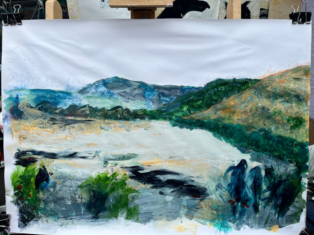
Today I’ve grasped the nettle – plenty of those about just now grasping at me so it’s only fair! – and take a run at a landscape with a view to Streetonise West Sussex.
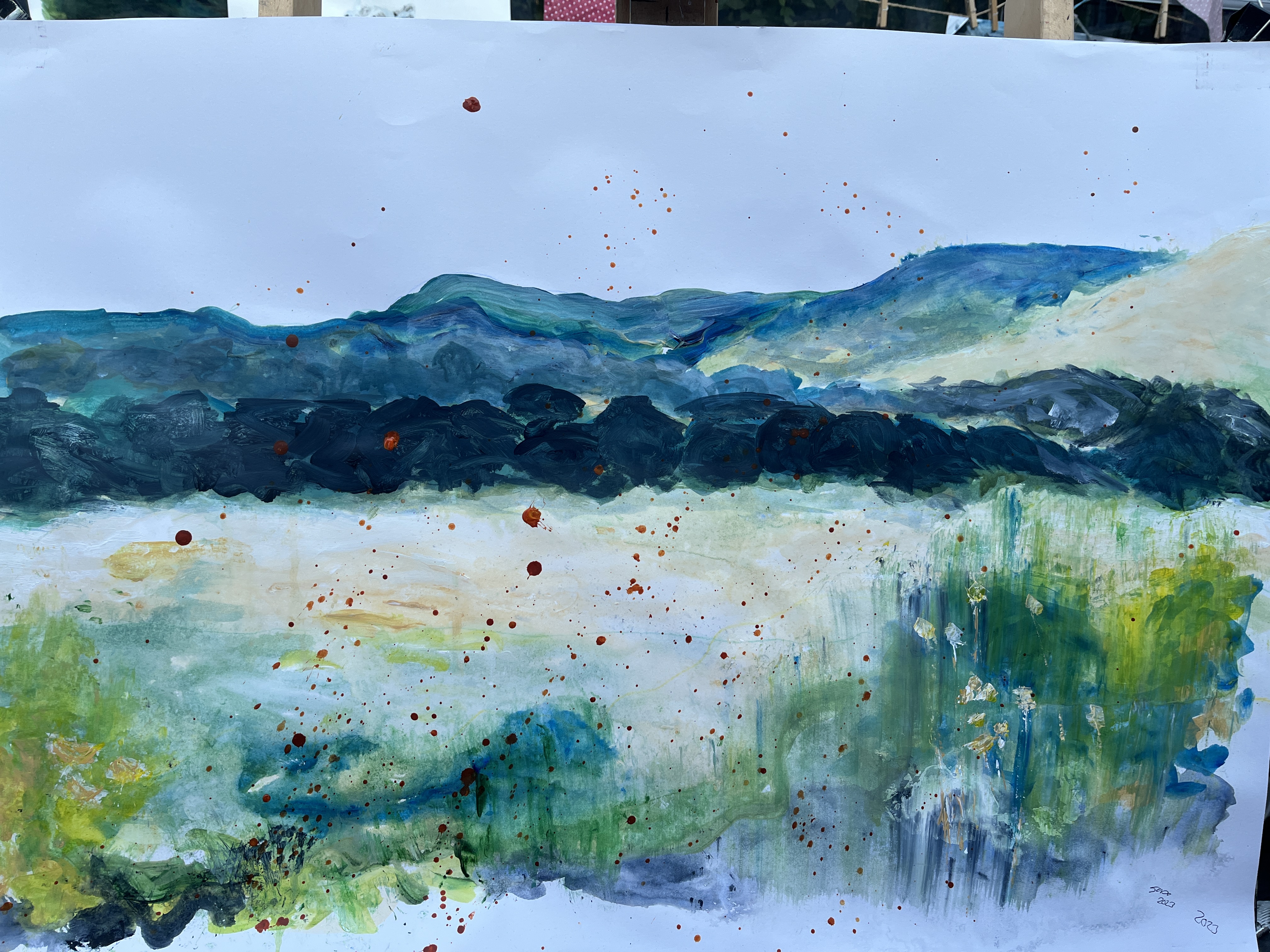
I’ve used an A1 cartridge surface, untreated, on which I drew out faint lines of the various key features in the landscape. Then I sprayed the whole with water and applied dilute white paint within the shapes of those features.
Without waiting for it to dry, I dropped further dilute pigment into those areas according to the prevailing tones which range from white through muted yellow (I’ve used Naples) to blues, greens, and patches of bright green/yellow.
Once it was almost dry, I put it upright so I could see the whole image properly, wicked free paint/water from the remaining wet areas, and dropped it on the floor.
Streeton seems to paint his skies vertically, and does the same in patches of foliage. I’m considering leaving the sky unpainted but there was a patch of foliage that needed to be more indeterminate than it was and so I flicked that upwards with some paper towel roll.
As always, I’m tempted to fill all the gaps, to define vague shapes, and to answer questions quite possibly no one is asking.
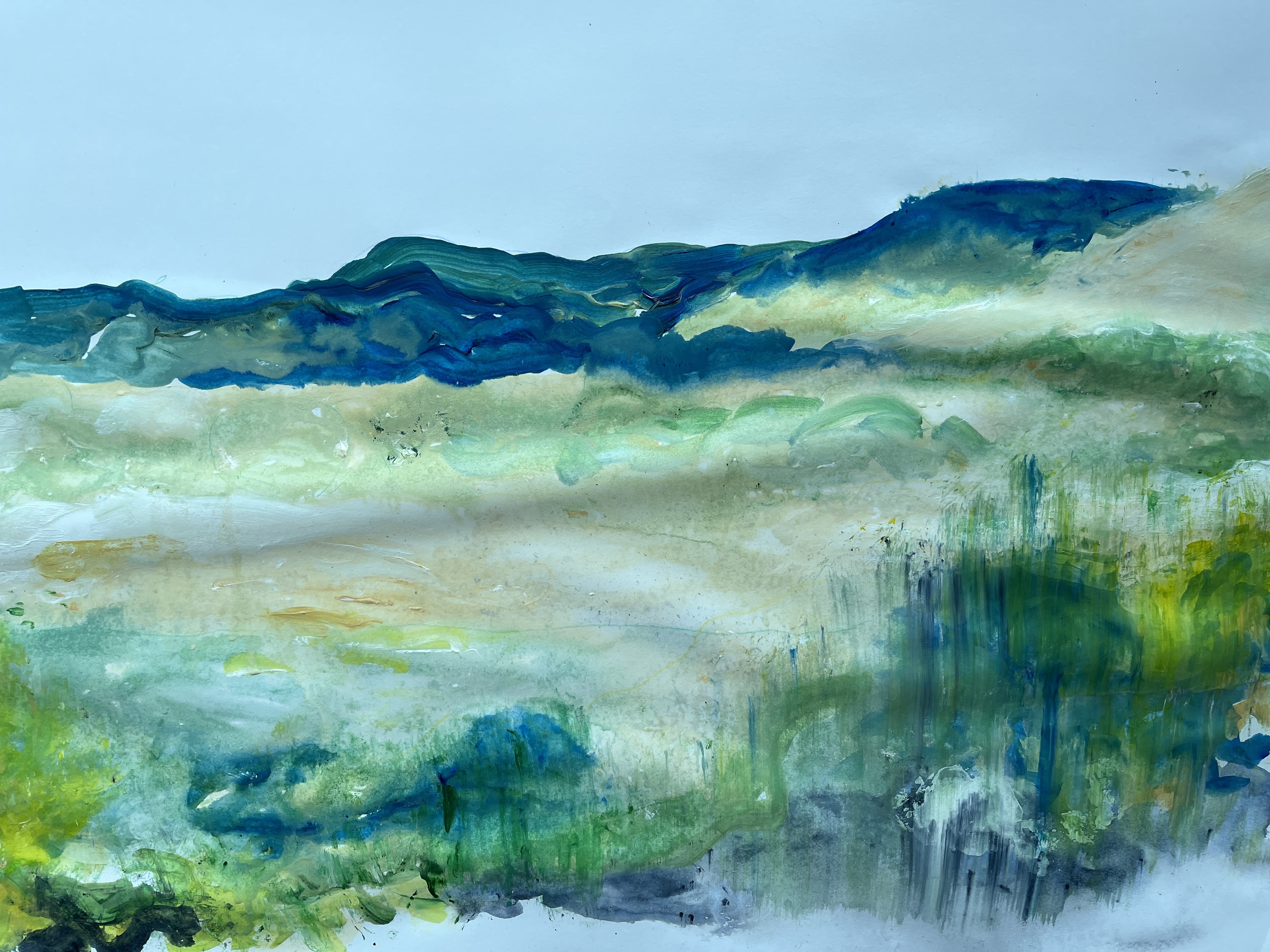
When I took the photos of the valley, I also took some of the flowers growing wild up near the castle. Streeton includes vegetation by very subtle – thin stems and tiny dots – and I can see an area bottom right that would lend itself to this. I think the tree line in the mid-ground needs to be strengthened a little but; note to self: NOT TOO MUCH! I need to review Streeton’s body of impressionistic work to see if there are hints as to how I can do this without finishing it off as opposed to just finishing it.
How does this fit with the rest of my work? The common factor in everything I’ve done recently is the inclusion of an augmented reality layer. Mostly this has been tinkering around with animations but I have also used greenscreen to project video (on licence or with rights via monetary donation), some of which makes social or political points (see ToyTown https://youtu.be/i2e-lUbzKkk), and like most people I’ve become increasingly concerned about cimate change, the deniers, the enablers, and the ignorant. Looking at the wealth of greenery here, I feel the threat of its loss acutely. Today there were so many butterflies in my buddleia bush and on my neighbour’s house, I called her out to see. How long is that going to last while political energies are seemingly focused on self interest and the low horizons of their own lives? So I aim to present a possible future for us using the AR layer.
I have more green scenes but I also have this, a massive tanker arriving at Duluth harbour on the US/Canada border. Many of these carry mined minerals and fossil fuels and are powered by diesel. Streeton painted the 19th-century equivalent; big cargo ships belching smoke from their chimneys but with the early industrial ignorance we can’t claim.

Not so sure about that central strand of shrubs. Maybe I’ll raise their tops so that the tract of field above becomes more of a streak. There are actually houses in that strip but, along with ditching the beech tree branches making a Disney frame around the whole scene, I’m leaving them out.

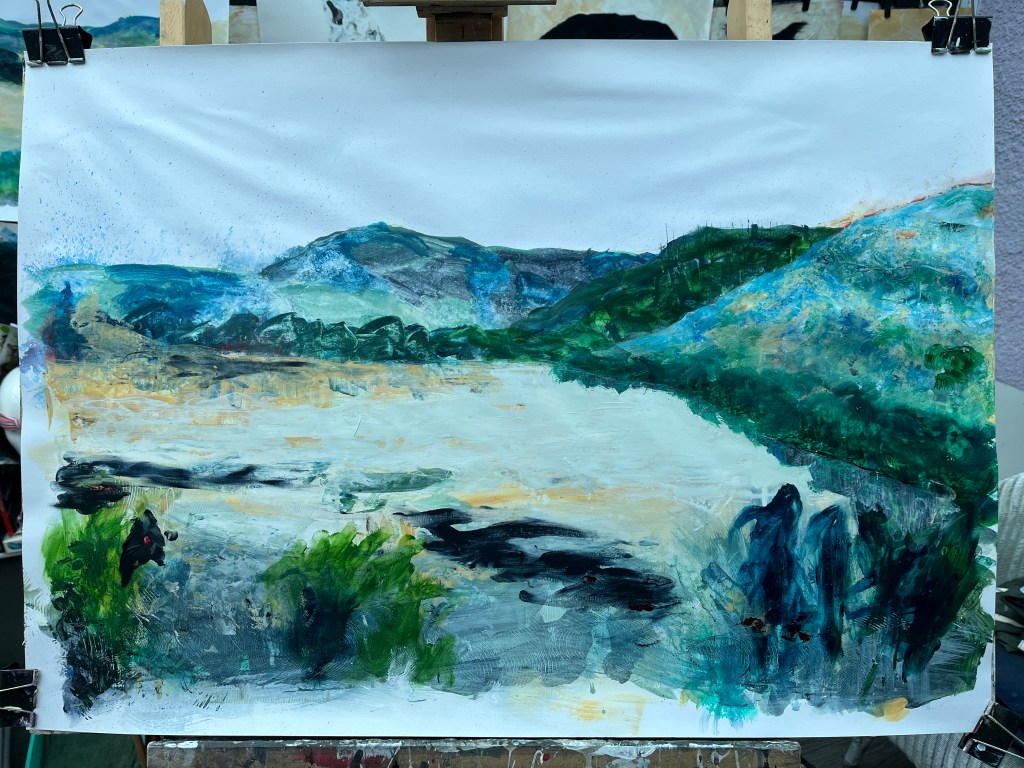
I can’t help thinking the first is the best. This has become ponderous. Tomorrow, I’ll try editing the middle ground and lower-distance areas but really, the lesson is here to be understood and absorbed, so perhaps I’ll also start a second version from scratch.
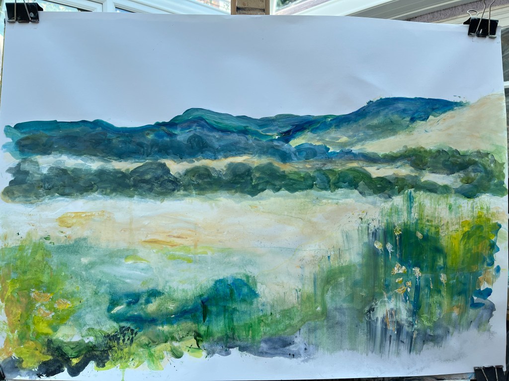
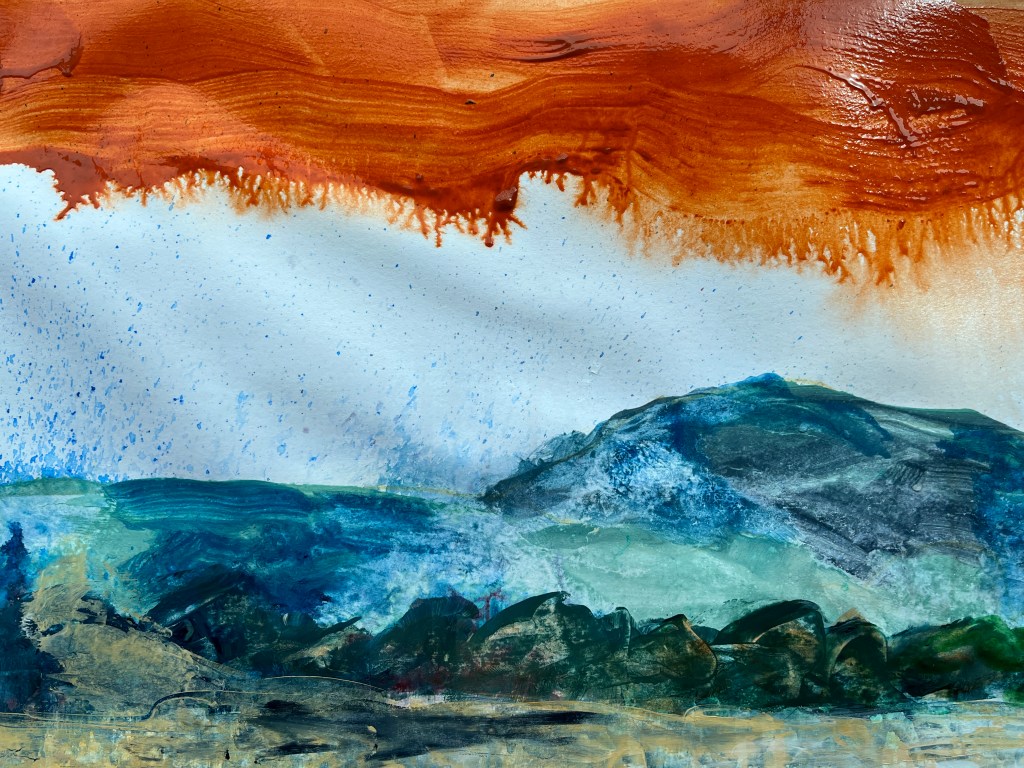
21st July, posting 22nd. This went weird very quickly! I began to have ideas that conflicted with the original notion of Streetonising my locality as shapes appeared in the dilute fluid paint on the surface. Most of the first image was made with the easel lying flat which meant I had no sense of how it looked as a whole so I became drawn into small areas of material.

Once upright, I found the folds in the cartridge also changed the way the painting presented itself and suggested different interpretations as to its narrative.

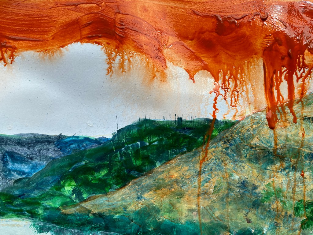
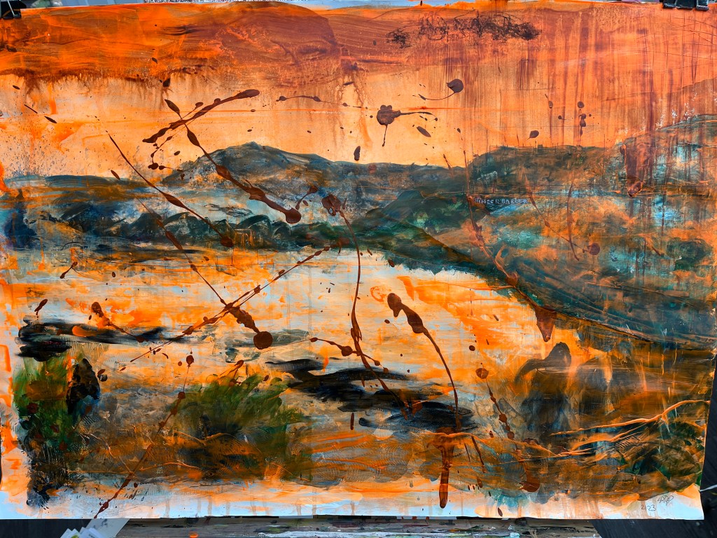
The first issue was structural – I didn’t like the horizontal ‘frame’ at the bottom so I washed some of it out and changed the shapes of the others so they had a less literal foliage stamp to them. Then, having figuratively set fire to the slope on the right, I tried to minimise that while leaving some of the red in place. By last night, it had become quite post apopcalyptic but with a strangely textured hillside drawing my eye unnecessarily.

22nd July. In daylight, I began to see leaping dolphins or whales in the field which has become an inland sea due to global warming. This changed how I saw that hill which is resisting being fixed.

I have somehow made a tree line along the water’s edge and unknowingly positioned reflections. That darned hillside though ..!
Now it looks like a fancy bedspread, but I’m armed with some dilute burnt umber to take the bite out of the blue once the paint there is dry.
Ach!

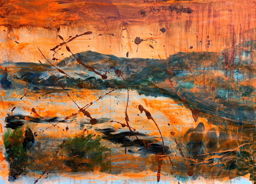
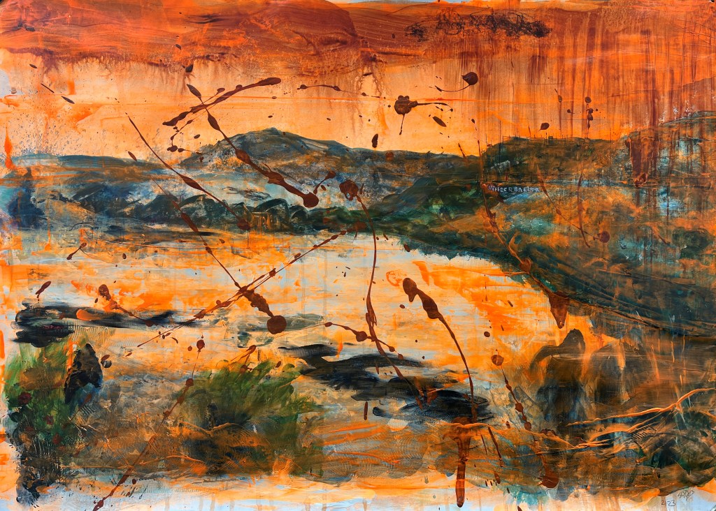
Yeah, right! For now, that feels close enough to ‘better’ that I can only make things worse if I tinker with it. A narrative has developed which leads me to title it 2123.
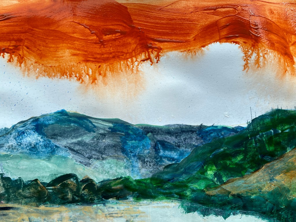
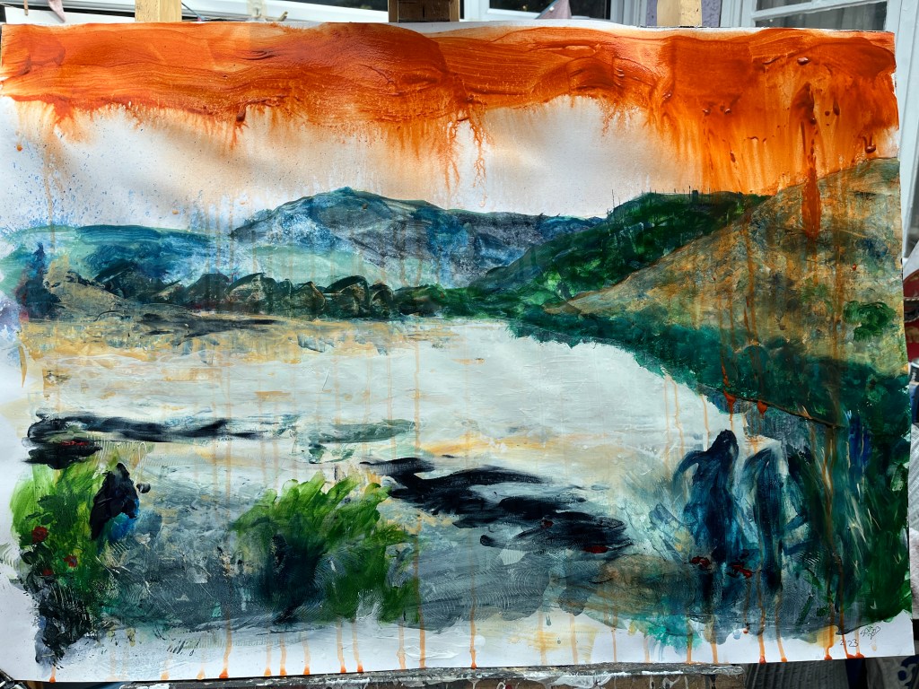
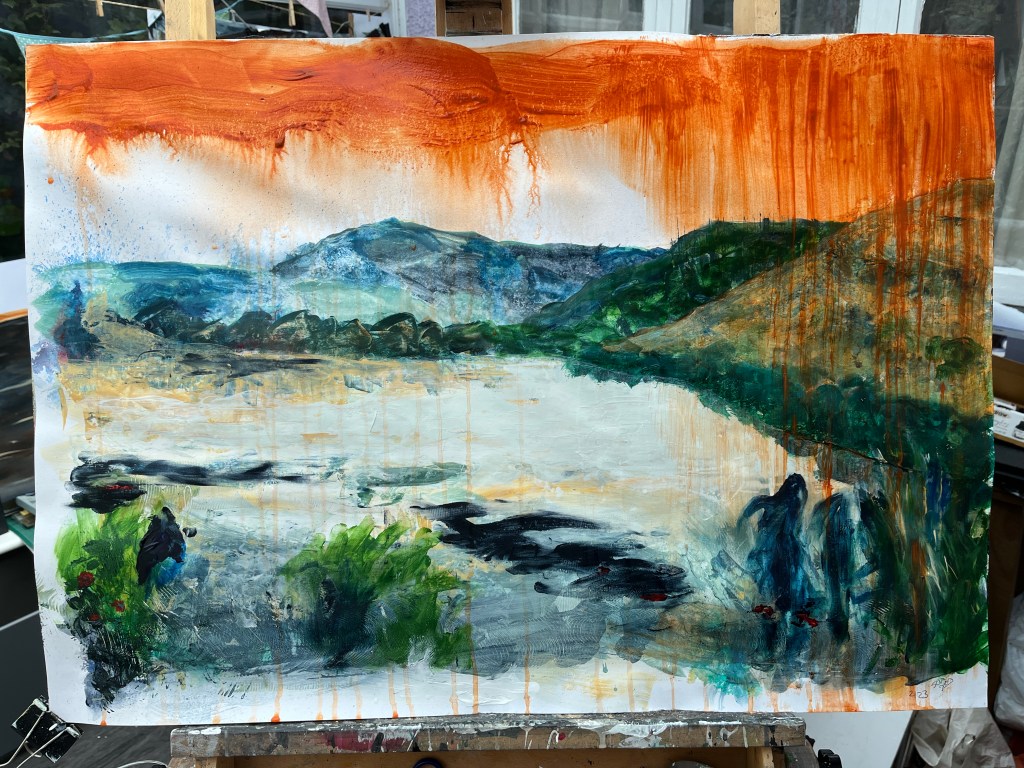
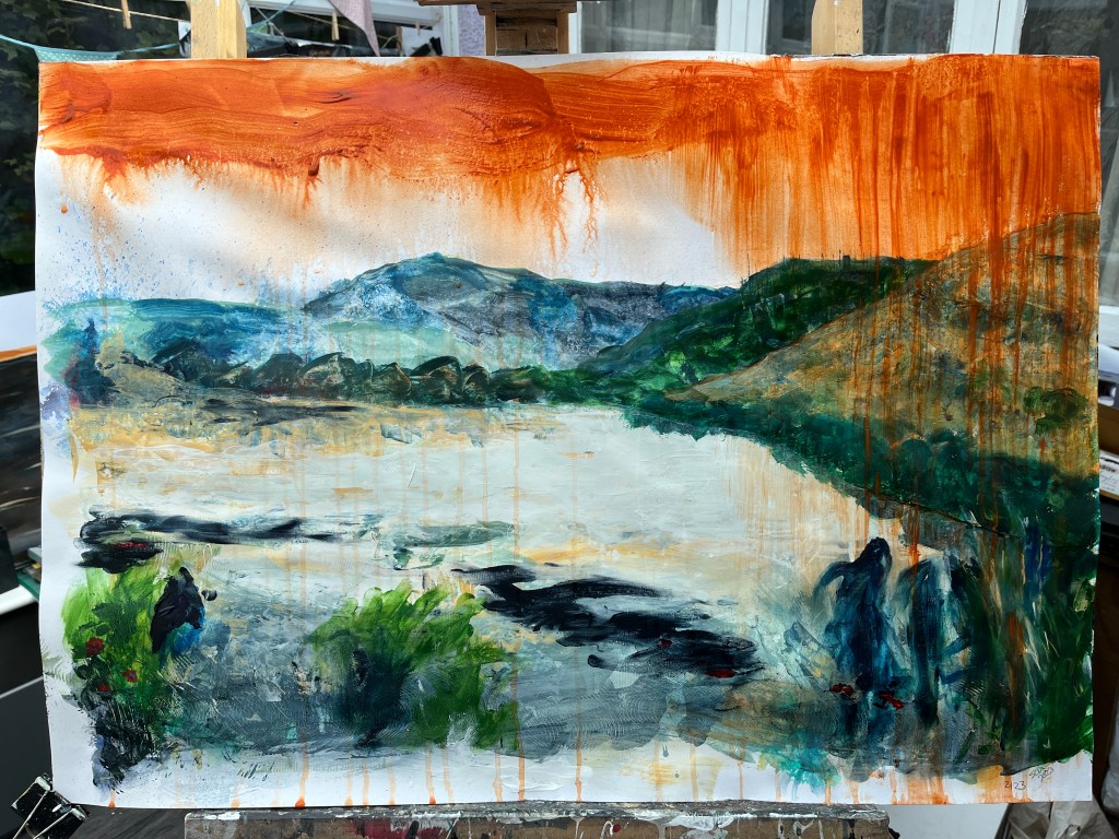
23rd July and the underlying climate theme asserted itself. It’s taken its time, is all I have to say. Going with the #JustStopOil theme, I’ve variously dripped, flicked, and puddled dark orange (and possibly riotious pink, I haven’t made my mind up about that) onto the three stages of urgency. The first – a few splashes onto the original painting – reflects the use of confetti in the protests; the second drips and splashes curtains of dark orange from the top and across the painting; and the third, which I think cries out for pink but we’ll see, will hopefully dominate the painting. I have photographic and video records of the dripping process, and photos of the others as those happened too fast for me to operate the camera at the same time as making the marks. I’ll put the videos and probably some of the images into a single film.


It’s fair to say I’ve left Streeton a long way behind. While I’m never sure what my style is, I feel it when I’m shoe-horning myself into someone else’s. Like being in a box of my own making and the only solution is to break out of it. The good thing is I found some new techniques and also discovered that the urge to make complex images is overwhelming. When I deny myself that, my creativity takes a hike and can be some while coming back.
25th July and I don’t think we’re in Kansa any more, Toto.
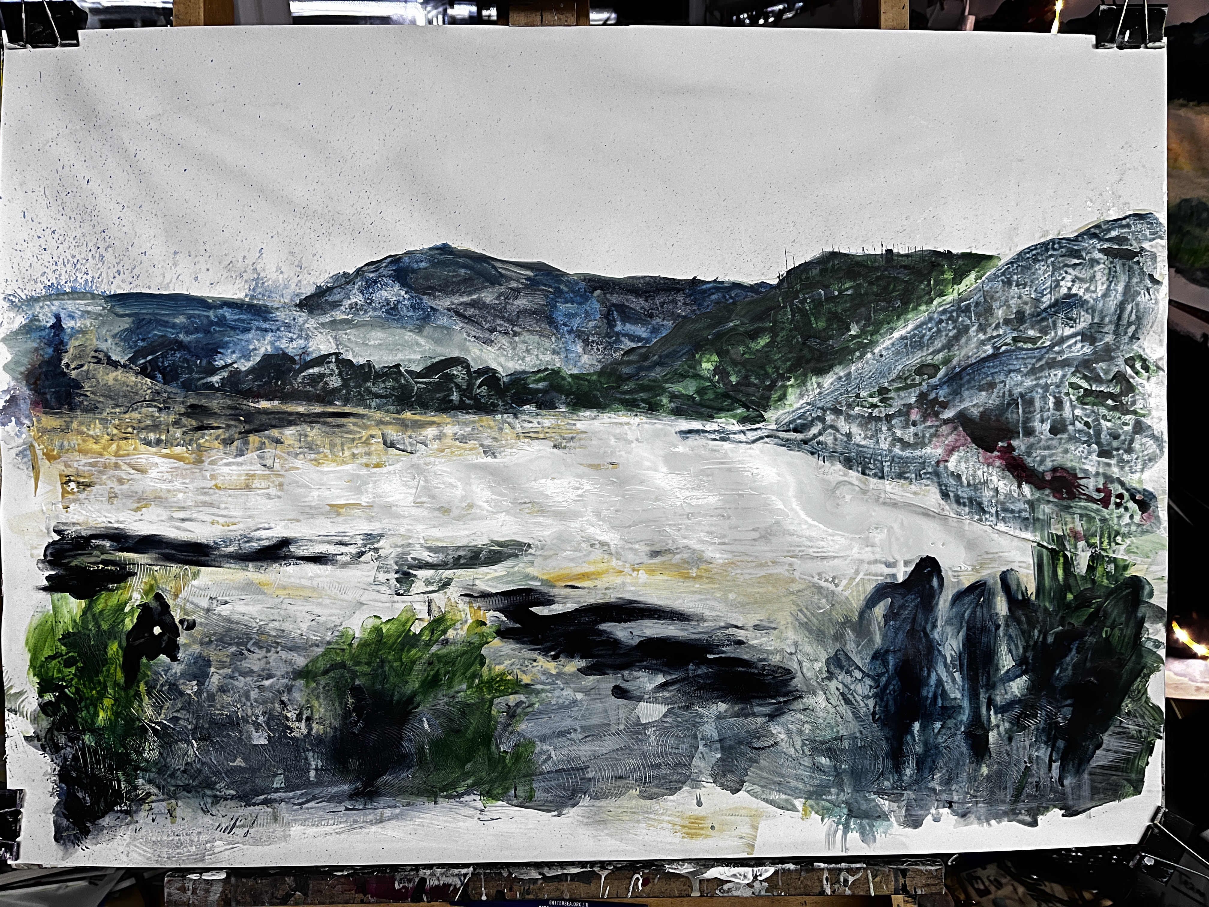
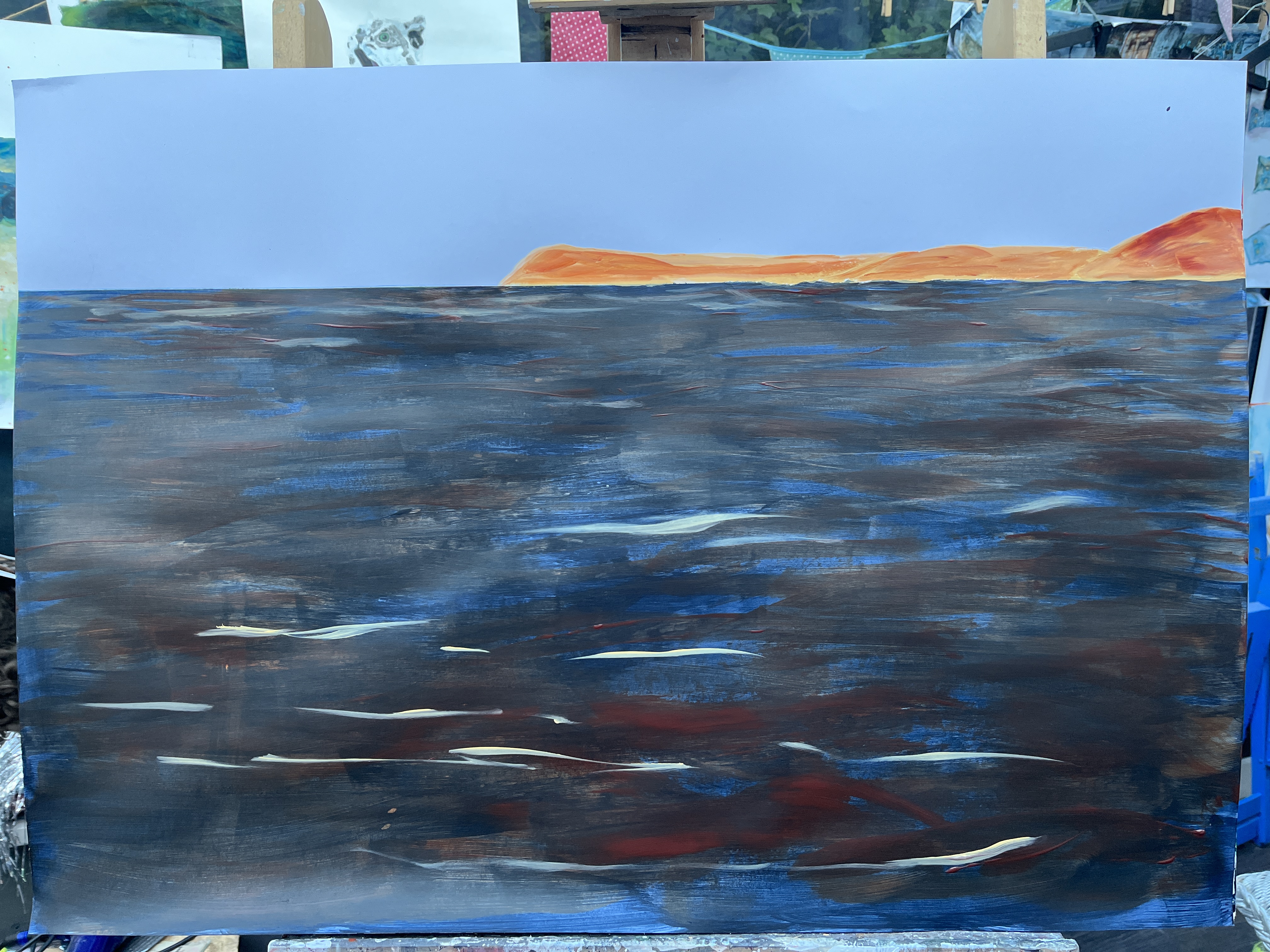
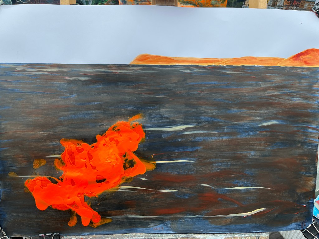
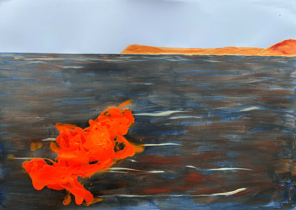
Quite a lot happened yesterday, including despair and near satisfaction about two different paintings. The one above was the despair and the one below the success. Each represents a different kind of protest tactic used by Just Stop Oil – the first confetti, the second soup on a painting, which wasn’t harmed. The third was to be a puddle of orange in the middle of the dark stretch of water now filling the river valley where the shrubs and grasses were, but I found it hard to make regular acrylic paint fluid enough to pool while still being controllable. Too late, I remembered about pouring paint and ordered some.
This is currently titled 2023 and the second one 2123 which meant some kind of projection into the future for the third painting, and I was mulling that over at the point when it ocurred to me that titling them Just, and Stop, and Oil might work.
Today the pouring paint arrived and what a joy that was!

The marine life is still there, hanging on by a thread, and I found the shape of two ships in the flooded valley. This is not inconsistent with local history as the river used to come right up to the town in around 800-1100CE and much of this low-lying land was under water. This changed when the river mouth silted up and the port shifted to Shoreham, leaving Steyning literally high and dry.

I’m not able to sit this one upright yet as it’s still quite fluid. The pouring paint, which is almost neon in colour, lies on top of the orange acrylic I applied earlier and I really can’t wait to see it full on. This ‘flood’ of orange represents JSO’s wash of orange fluid they have sprayed on windows in the City.
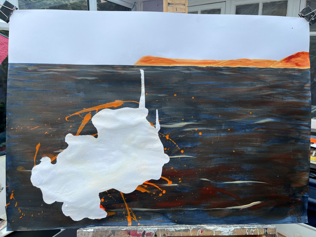
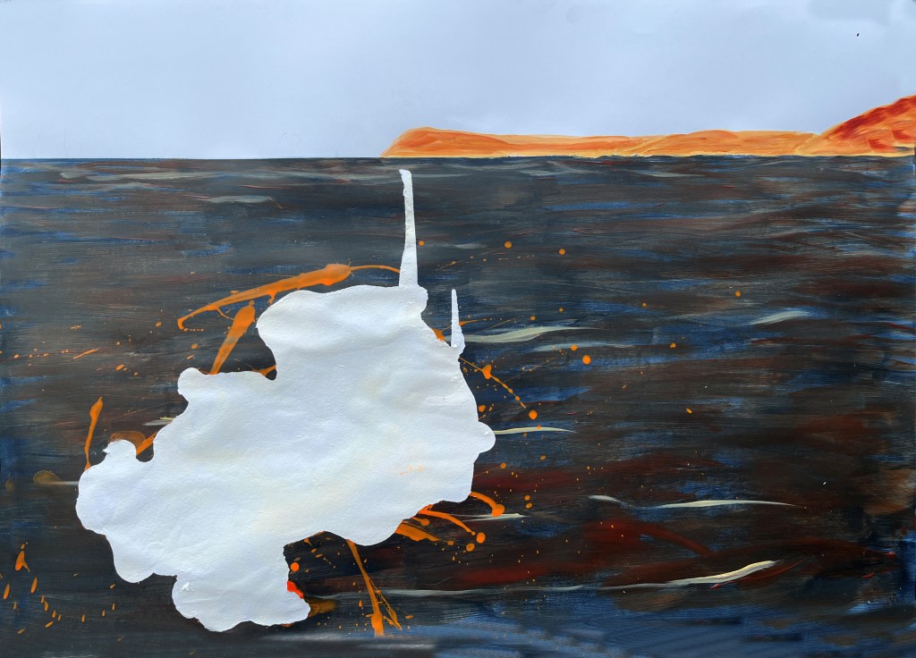
This, I think, is the final stage for the second painting where the pouring paint helps to form the grim backdrop to large ships on the waterway that used to be our green valley. I’ve drawn on the tankers that come in and out of Duluth harbour for these faintly suggested, barely visible ships which I’ve marked out in biro like a technical drawing. The largest of the two here is the James R Barker which has a horn capable of rattling your teeth and which I am hoping to record for the video I’ll be making. I’m really very pleased with the brightness the pouring orange adds to the darker orange beneath, and the lift it gives to the blues which, although originally hillsides, seem to become quite metallic when partially exposed here. I can almost believe a tiny bit of Streeton’s light has made its way through the water here.
I’ve added what’s become the motif of the series, the orange paint. Here it’s just dots, making the point that the warning signs are there if we would only pay attention. I needed to add some more dribbles to the final piece so it’s been solidifying for a few hours.
And it began to run again so, one quick snap and it’s over on its back with another small dribble in the pothole it left! This will do though for storyboarding the video.
2023-2223

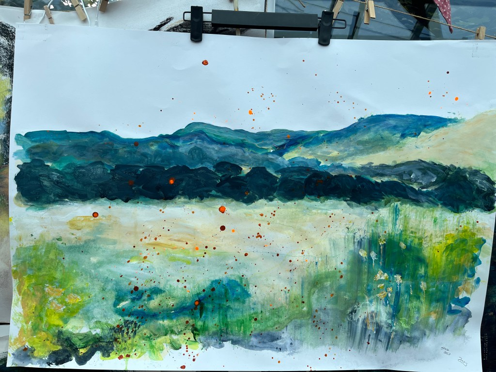
2023. Our valley; green and yellow with life buzzing in every square inch. But the warning signs are there – see the orange pointillistic dots; the pox on the face of beauty? This fierce orange is the motif of our stupidity.
2123. Our town is a port again, but not trading in textiles and exotic spices as it did in the 800CE. Now, in a gross mash-up of Turner and Dante, rusting metal dinosaurs squeeze up the flooded valley past marine life gasping for breath where there is none. Can you see them?
2223. Nowhere is a port any more. This is it; all that’s left of us – a toxic slick of grunge on a turgid sea. Less Dante than Dali but sans clock. Who was it threw paint onto buildings so long ago, trying to wake us up?
29th July. The final piece is still drying after several reapplications of orange paint to encourage dribbles and spread, followed by the hazard of insects becoming embedded in it. But in the meantime I’ve discovered that I can take better photos if I wear my stronger off-the-peg reading glasses for the camera view.

30th July and that third painting is niggling me. The orange blob seems too strong even for its message, too distracting and self-important without ever fulfilling my ambition for it. Then I realised I could (possibly) peel it off, carfeully did so, and revealed a much more impactful white space. It’s taken the surface off the card – and what a lucky choice because I could not have doen this had it been papaer – which has begun to ripple a little. So now it’s on its back with water sprayed into the space in the hope this will tighten it up. The blob, meanwhile, is contemplating an independent furture.
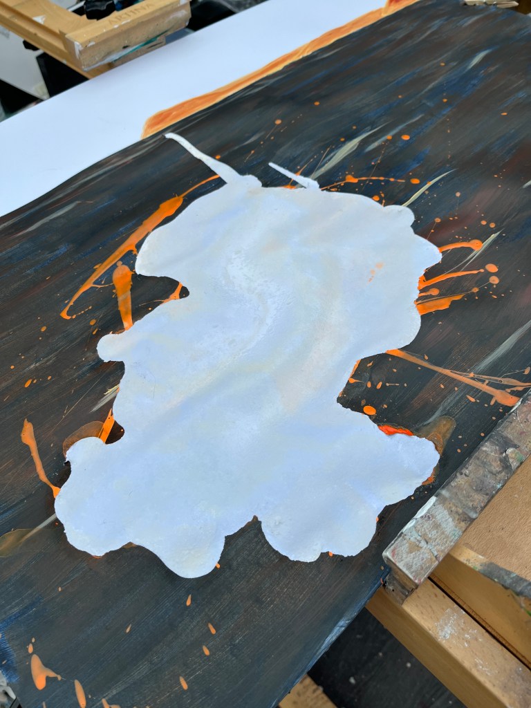
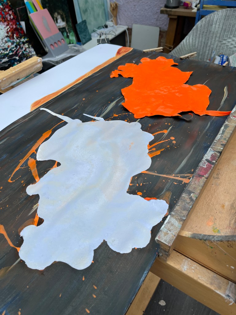
The water treatment worked quite well but it still needed an iron on a flat surface to flatten the wrinkles, and for a decent image on-screen which is less forgiving than the naked eye which tends to see what it wants to see, it needed some digital assistance.


I’ll be importing the white flood and green flood into the video suite to complete the likely trajectory of the Adur valley should climate change not be at least halted and soon.
1st August. This video has required detailed focus on timing and the juxtapositions/overlapping of layers to deliver the impact I was looking for. The narrative is that of the projected future of the Adur Valley from now to 2223 when, without significant reduction of atmospheric CO2 levels, global warming will lead to glacial melt and sea level rise which will obliterate some countries and significantly reduce the land availability of others. Superimposed on this theme is one of dirty industry – oil, coal, and gas – which, while it delivered the 20th century and the advances made in those years, also set the scene for the destruction of the one thing that should now be our priority, the maintenance of a healthy world for the species living on it. We got ourselves here; we should be smart enough to get ourselves, along with the rest of the flora and fauna of which we are guardians, out of it.
The video will be Artivive enabled in all three paintings.
SCH 2023
For a list of workshops, groups, conversations, and other activities see my dedicated page
